
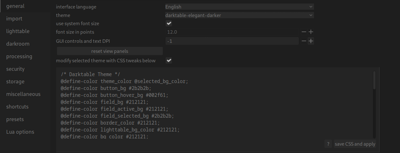
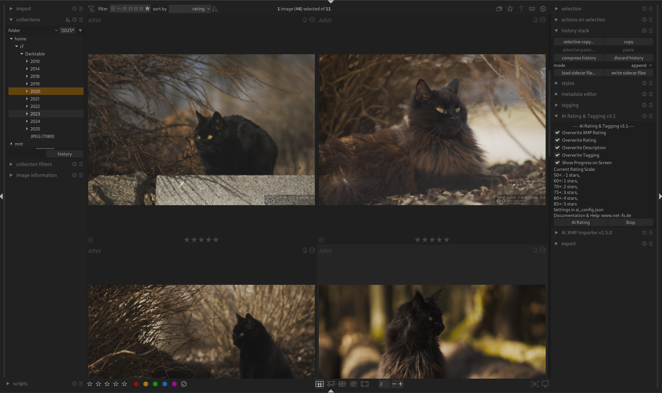
Installation: Code in die Zwischenlage kopieren und in den Darktable Einstellungen unter „Allgemeines“ einfügen. Speichern. Fertig.
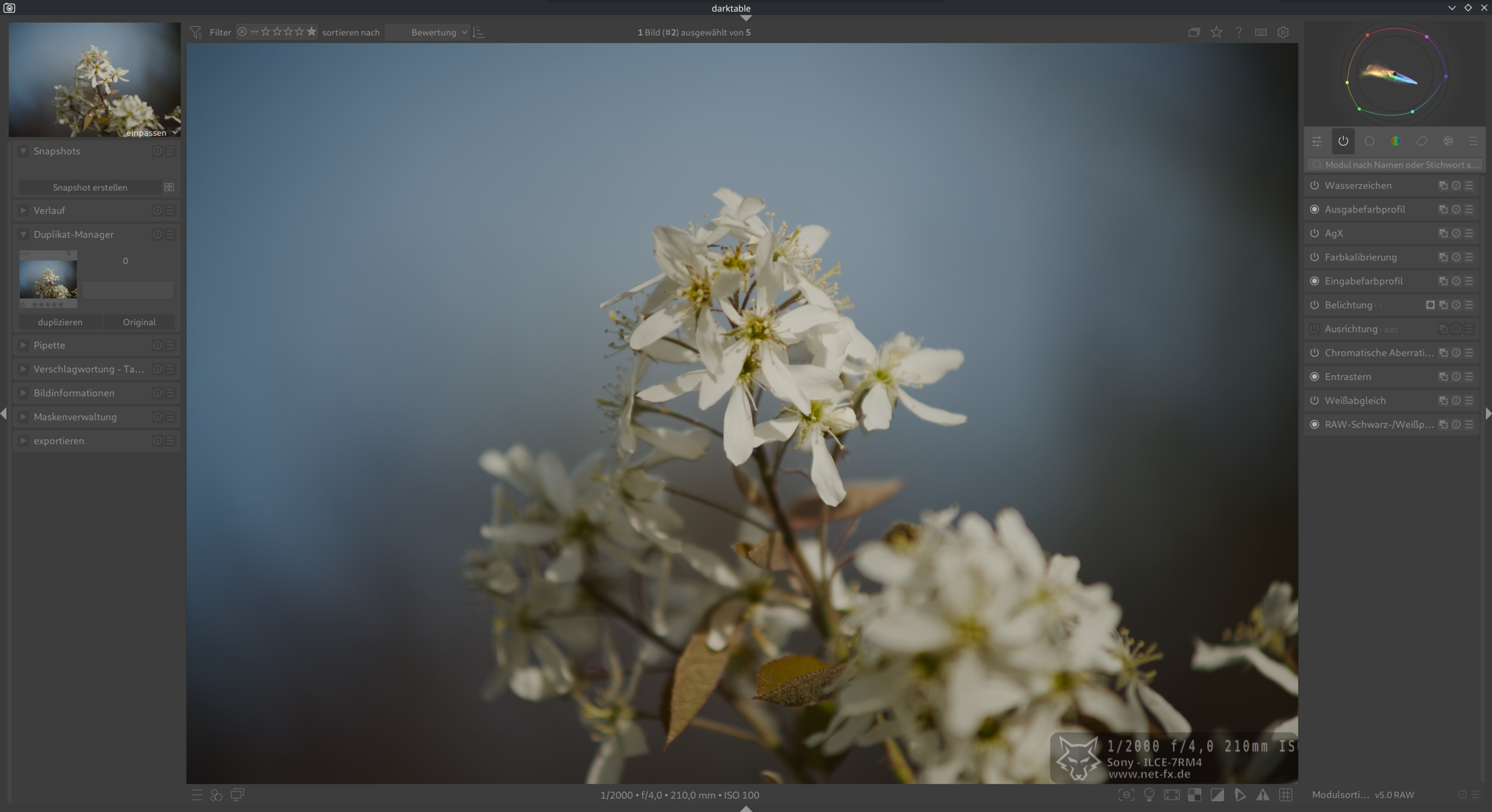
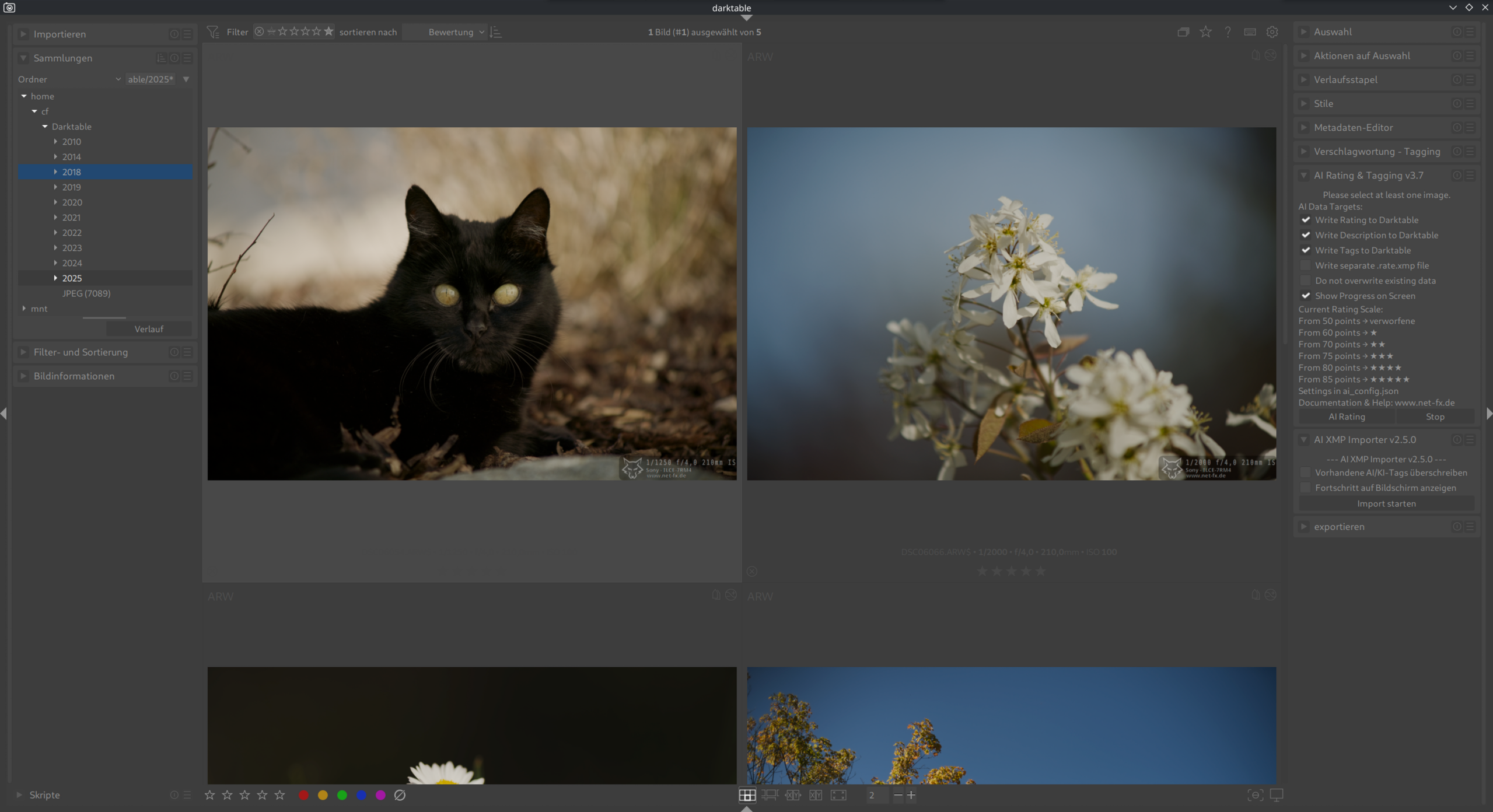
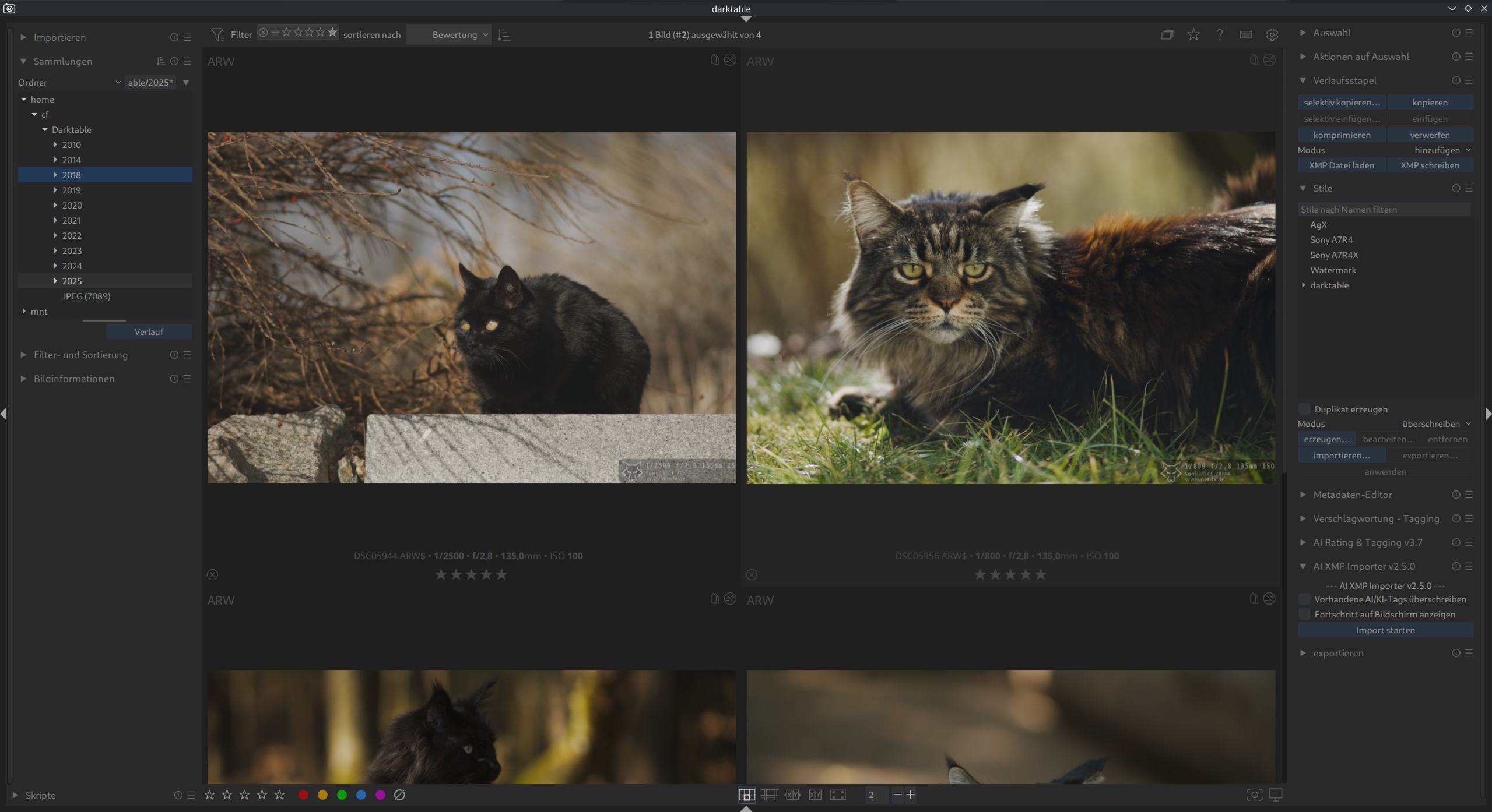
Modernes graues und minimalistisches Theme mit blauen Farbakzenten – Modulsymbol grau. (30.10.2025)
CSS
/* Darktable Theme */
@define-color theme_color @selected_bg_color;
@define-color button_bg #3d3d3d;
@define-color button_hover_bg #004c9e;
@define-color field_active_bg #525252;
@define-color field_bg #424242;
@define-color field_selected_bg #3b3b3b;
@define-color border_color #3b3b3b;
@define-color lighttable_bg_color #3b3b3b;
@define-color plugin_bg_color #454545;
@define-color fg_color #969696;
@define-color darkroom_bg_color #383838;
@define-color filmstrip_bg_color #383838;
@define-color bg_color #3d3d3d;
@define-color collapsible_bg_color #3b3b3b;
@define-color plugin_label_color #949494;
@define-color bauhaus_bg #3d3d3d;
@define-color bauhaus_fill #004c9e;
@define-color scroll_bar_bg #3b3b3b;
@define-color scroll_bar_inactive #454545;
@define-color scroll_bar_active #004c9e;
@define-color thumbnail_hover_bg_color #5c5c5c;
@define-color thumbnail_star_bg_color #3d3d3d;
@define-color thumbnail_selected_bg_color #454545;
@define-color thumbnail_bg_color #3d3d3d;
@define-color thumbnail_star_hover_color #004c9e;


/* Manually override the thumbnail overlay background */
.dt_overlays_hover_extended #thumb-main:hover #thumb-bottom,
.dt_overlays_mixed #thumb-main:hover #thumb-bottom,
.dt_overlays_hover #thumb-main:hover #thumb-bottom {
    background-image: none;
    background-color: #3d3d3d;
}

#left {
  padding: 0 8px 0 0;
}

#left > :not(scrolledwindow) {
  padding-left: 4px;
}

#right {
  padding: 0 0 0 8px;
}

#right > :not(scrolledwindow) {
  padding-right: 0px;
}


#plugins_vbox_left > box:not(#basics-box-labels) {
  background-color: @plugin_bg_color;
  border-radius: 4px;
}

#basics-module-hbox,
#plugins_vbox_left > box:not(#basics-box-labels) {
  margin-bottom: 4px;
}

#basics-box-labels widget,
#basics-module-hbox {
  background-color: @plugin_bg_color;
}

#basics-box-labels widget {
  border: none;
}

#basics-module-hbox,
#plugins_vbox_left frame.dt_plugin_ui {
  border-radius: 0 0 4px 4px;
}

#basics-module-hbox {
  padding: 0px 0 0px;
}

#basics-box-labels #basics-header-box {
  padding: 6px 4px 6px 10px;
}

#basics-module-hbox + widget {
  border-radius: 4px 4px 0 0;
}

#plugins_vbox_left #module-header,
#left > box:nth-child(3) #module-header,
#right > box:nth-child(3) #module-header {
  border: none;
}

.dt_plugin_ui #blending-tabs .dt_module_btn,
#modules-tabs .dt_module_btn
{
  padding: 0.5em;
  margin: 0.2em;
  border-radius: 4px;
}

.dt_plugin_ui #blending-tabs
{
  border-radius: 0 0 4px 4px;
}


#left > box:first-child,
#modules-tabs {
  margin-bottom: 4px
}


.font {
  margin: 8px 0;
}

.dt_plugin_ui #blending-tabs
{
  background-color: shade (@plugin_bg_color, 1.3)
}

.dt_section_label {
  border: none;
  background-color: shade (@plugin_bg_color, 1);
  border-radius: 4px;
}


#module-filtering #collect-rule-widget:last-child {
  border-bottom-left-radius: 6px;
  border-bottom-right-radius: 6px;
}

/* Increase min-height to account for auto-hideable buttons */
#module-header {
  min-height: 6px;
}


#module-header .dt_module_btn {
    color: shade(@plugin_label_color, 0.6);
    background-color: shade(@plugin_bg_color, 0.9);
}


#module-header .dt_module_btn:checked {
  color: shade(@plugin_label_color, 1.2);
  background-color: shade(@plugin_bg_color, 1.0);
}

#module-header .dt_module_btn:checked ~ .dt_module_btn{
    color: shade(@plugin_label_color, 0.9);
    background-color: shade(@plugin_bg_color, 1.1);

}
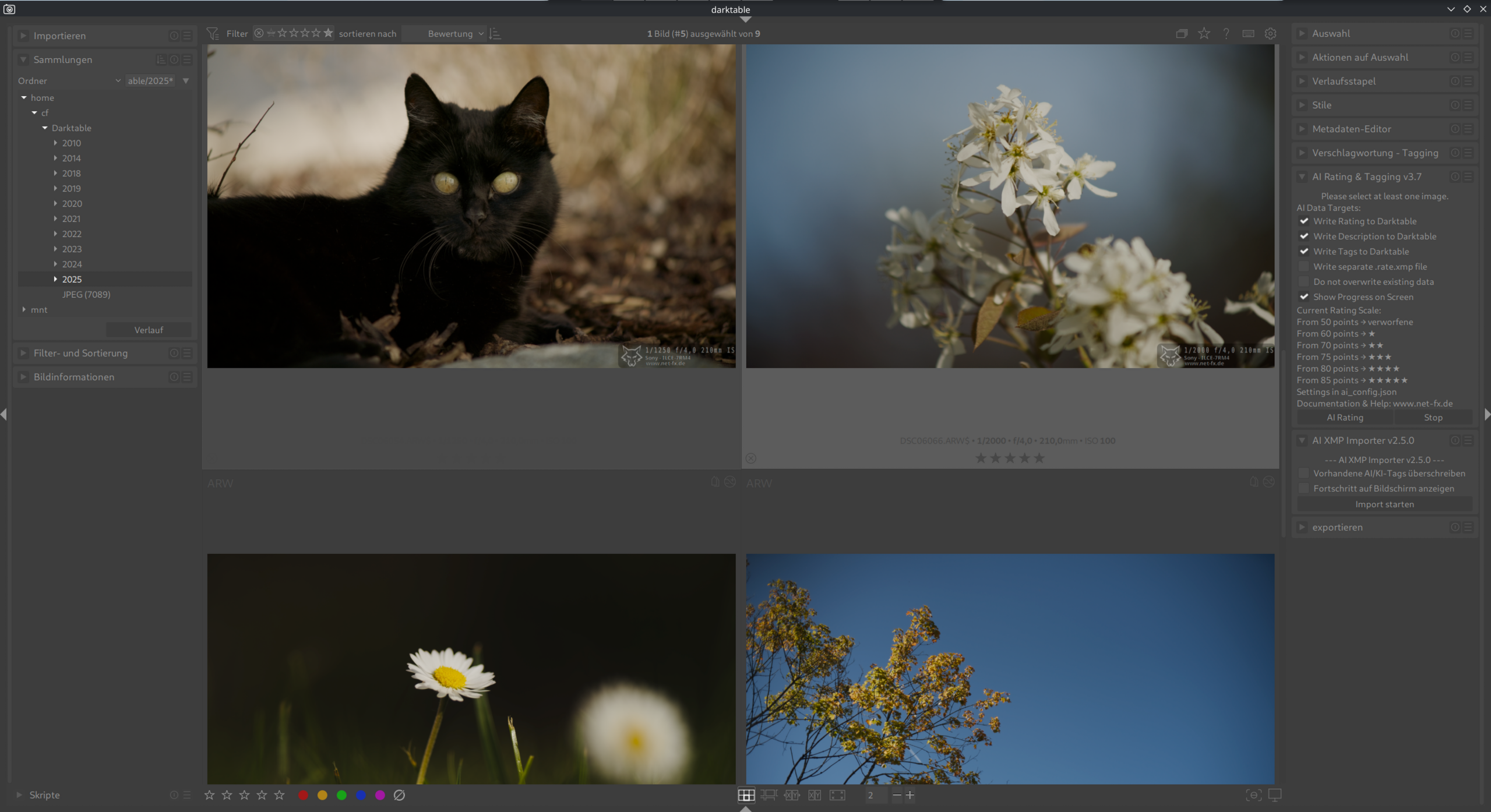
Modernes graues und minimalistisches Theme mit blauen Farbakzenten. (30.10.2025)
CSS
/* Darktable Theme */
@define-color theme_color @selected_bg_color;
@define-color button_bg #3d3d3d;
@define-color button_hover_bg #004c9e;
@define-color field_active_bg #525252;
@define-color field_bg #424242;
@define-color field_selected_bg #3b3b3b;
@define-color border_color #3b3b3b;
@define-color lighttable_bg_color #3b3b3b;
@define-color plugin_bg_color #454545;
@define-color fg_color #969696;
@define-color darkroom_bg_color #383838;
@define-color filmstrip_bg_color #383838;
@define-color bg_color #3d3d3d;
@define-color collapsible_bg_color #3b3b3b;
@define-color plugin_label_color #949494;
@define-color bauhaus_bg #3d3d3d;
@define-color bauhaus_fill #004c9e;
@define-color scroll_bar_bg #3b3b3b;
@define-color scroll_bar_inactive #454545;
@define-color scroll_bar_active #004c9e;
@define-color thumbnail_hover_bg_color #5c5c5c;
@define-color thumbnail_star_bg_color #3d3d3d;
@define-color thumbnail_selected_bg_color #454545;
@define-color thumbnail_bg_color #3d3d3d;
@define-color thumbnail_star_hover_color #004c9e;


/* Manually override the thumbnail overlay background */
.dt_overlays_hover_extended #thumb-main:hover #thumb-bottom,
.dt_overlays_mixed #thumb-main:hover #thumb-bottom,
.dt_overlays_hover #thumb-main:hover #thumb-bottom {
    background-image: none;
    background-color: #3d3d3d;
}

#left {
  padding: 0 8px 0 0;
}

#left > :not(scrolledwindow) {
  padding-left: 4px;
}

#right {
  padding: 0 0 0 8px;
}

#right > :not(scrolledwindow) {
  padding-right: 0px;
}


#plugins_vbox_left > box:not(#basics-box-labels) {
  background-color: @plugin_bg_color;
  border-radius: 4px;
}

#basics-module-hbox,
#plugins_vbox_left > box:not(#basics-box-labels) {
  margin-bottom: 4px;
}

#basics-box-labels widget,
#basics-module-hbox {
  background-color: @plugin_bg_color;
}

#basics-box-labels widget {
  border: none;
}

#basics-module-hbox,
#plugins_vbox_left frame.dt_plugin_ui {
  border-radius: 0 0 4px 4px;
}

#basics-module-hbox {
  padding: 0px 0 0px;
}

#basics-box-labels #basics-header-box {
  padding: 6px 4px 6px 10px;
}

#basics-module-hbox + widget {
  border-radius: 4px 4px 0 0;
}

#plugins_vbox_left #module-header,
#left > box:nth-child(3) #module-header,
#right > box:nth-child(3) #module-header {
  border: none;
}

.dt_plugin_ui #blending-tabs .dt_module_btn,
#modules-tabs .dt_module_btn
{
  padding: 0.5em;
  margin: 0.2em;
  border-radius: 4px;
}

.dt_plugin_ui #blending-tabs
{
  border-radius: 0 0 4px 4px;
}


#left > box:first-child,
#modules-tabs {
  margin-bottom: 4px
}


.font {
  margin: 8px 0;
}

.dt_plugin_ui #blending-tabs
{
  background-color: shade (@plugin_bg_color, 1.3)
}

.dt_section_label {
  border: none;
  background-color: shade (@plugin_bg_color, 1);
  border-radius: 4px;
}


#module-filtering #collect-rule-widget:last-child {
  border-bottom-left-radius: 6px;
  border-bottom-right-radius: 6px;
}

/* Increase min-height to account for auto-hideable buttons */
#module-header {
  min-height: 6px;
}


#module-header .dt_module_btn {
    color: shade(@plugin_label_color, 0.6);
    background-color: shade(@plugin_bg_color, 0.9);
}


#module-header .dt_module_btn:checked {
  color: shade(@button_hover_bg, 1.2);
  background-color: shade(@plugin_bg_color, 1.0);
}

#module-header .dt_module_btn:checked ~ .dt_module_btn{
    color: shade(@plugin_label_color, 0.9);
    background-color: shade(@plugin_bg_color, 1.1);

}
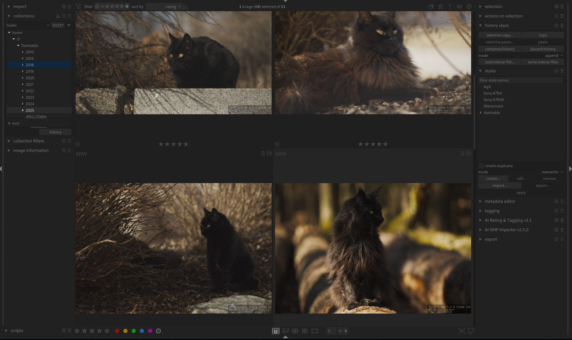
Modernes graues und minimalistisches Theme mit orangen Farbakzenten. (30.10.2025)
CSS
/* Darktable Theme */
@define-color theme_color @selected_bg_color;
@define-color button_bg #3d3d3d;
@define-color button_hover_bg #9e5c00;
@define-color field_active_bg #525252;
@define-color field_bg #424242;
@define-color field_selected_bg #3b3b3b;
@define-color border_color #3b3b3b;
@define-color lighttable_bg_color #3b3b3b;
@define-color plugin_bg_color #454545;
@define-color fg_color #969696;
@define-color darkroom_bg_color #383838;
@define-color filmstrip_bg_color #383838;
@define-color bg_color #3d3d3d;
@define-color collapsible_bg_color #3b3b3b;
@define-color plugin_label_color #949494;
@define-color bauhaus_bg #3d3d3d;
@define-color bauhaus_fill #6b4400;
@define-color scroll_bar_bg #3b3b3b;
@define-color scroll_bar_inactive #454545;
@define-color scroll_bar_active #6b4400;
@define-color thumbnail_hover_bg_color #5c5c5c;
@define-color thumbnail_star_bg_color #3d3d3d;
@define-color thumbnail_selected_bg_color #454545;
@define-color thumbnail_bg_color #3d3d3d;
@define-color thumbnail_star_hover_color #6b4400;

/* Manually override the thumbnail overlay background */
.dt_overlays_hover_extended #thumb-main:hover #thumb-bottom,
.dt_overlays_mixed #thumb-main:hover #thumb-bottom,
.dt_overlays_hover #thumb-main:hover #thumb-bottom {
    background-image: none;
    background-color: #3d3d3d;
}

#left {
  padding: 0 8px 0 0;
}

#left > :not(scrolledwindow) {
  padding-left: 4px;
}

#right {
  padding: 0 0 0 8px;
}

#right > :not(scrolledwindow) {
  padding-right: 0px;
}


#plugins_vbox_left > box:not(#basics-box-labels) {
  background-color: @plugin_bg_color;
  border-radius: 4px;
}

#basics-module-hbox,
#plugins_vbox_left > box:not(#basics-box-labels) {
  margin-bottom: 4px;
}

#basics-box-labels widget,
#basics-module-hbox {
  background-color: @plugin_bg_color;
}

#basics-box-labels widget {
  border: none;
}

#basics-module-hbox,
#plugins_vbox_left frame.dt_plugin_ui {
  border-radius: 0 0 4px 4px;
}

#basics-module-hbox {
  padding: 0px 0 0px;
}

#basics-box-labels #basics-header-box {
  padding: 6px 4px 6px 10px;
}

#basics-module-hbox + widget {
  border-radius: 4px 4px 0 0;
}

#plugins_vbox_left #module-header,
#left > box:nth-child(3) #module-header,
#right > box:nth-child(3) #module-header {
  border: none;
}

.dt_plugin_ui #blending-tabs .dt_module_btn,
#modules-tabs .dt_module_btn
{
  padding: 0.5em;
  margin: 0.2em;
  border-radius: 4px;
}

.dt_plugin_ui #blending-tabs
{
  border-radius: 0 0 4px 4px;
}


#left > box:first-child,
#modules-tabs {
  margin-bottom: 4px
}


.font {
  margin: 8px 0;
}

.dt_plugin_ui #blending-tabs
{
  background-color: shade (@plugin_bg_color, 1.3)
}

.dt_section_label {
  border: none;
  background-color: shade (@plugin_bg_color, 1);
  border-radius: 4px;
}


#module-filtering #collect-rule-widget:last-child {
  border-bottom-left-radius: 6px;
  border-bottom-right-radius: 6px;
}

/* Increase min-height to account for auto-hideable buttons */
#module-header {
  min-height: 6px;
}


#module-header .dt_module_btn {
    color: shade(@plugin_label_color, 0.6);
    background-color: shade(@plugin_bg_color, 0.9);
}


#module-header .dt_module_btn:checked {
  color: shade(@button_hover_bg, 0.9);
  background-color: shade(@plugin_bg_color, 1.1);
}

#module-header .dt_module_btn:checked ~ .dt_module_btn{
    color: shade(@plugin_label_color, 0.85);
    background-color: shade(@plugin_bg_color, 1.1);

}
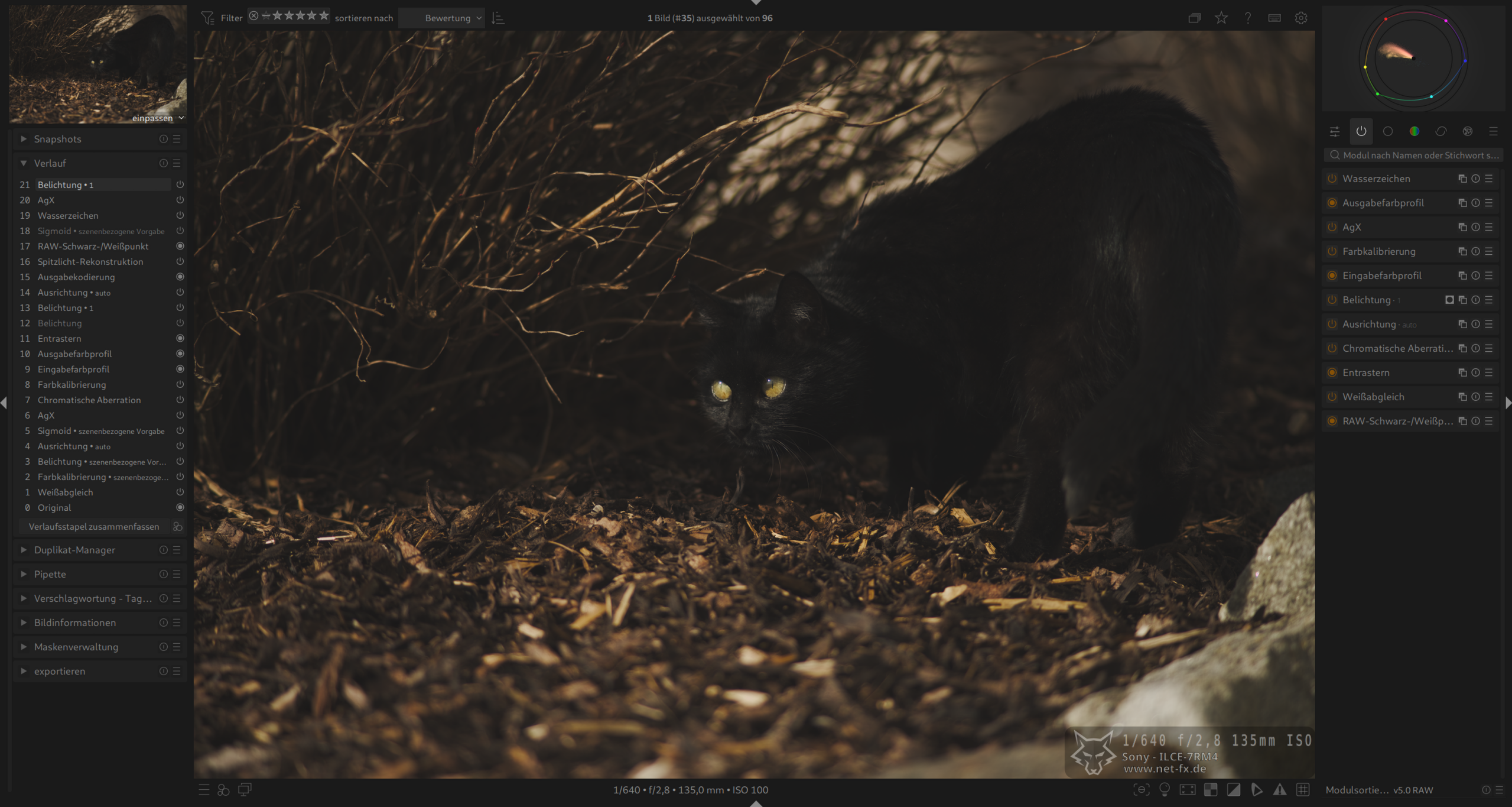
Modernes dunkleres und minimalistisches Dark-Theme mit orangen Farbakzenten. (28.10.2025)
CSS
/* Darktable Theme */
@define-color theme_color @selected_bg_color;
@define-color button_bg #262626;
@define-color button_hover_bg #9e5c00;
@define-color field_active_bg #212121;
@define-color field_bg #1f1f1f;
@define-color field_selected_bg #2b2b2b;
@define-color border_color #1a1a1a;
@define-color lighttable_bg_color #171717;
@define-color plugin_bg_color #212121;
@define-color fg_color #8c8c8c;
@define-color darkroom_bg_color #1a1a1a;
@define-color filmstrip_bg_color #141414;
@define-color bg_color #1a1a1a;
@define-color collapsible_bg_color #1f1f1f;
@define-color plugin_label_color #808080;
@define-color bauhaus_bg #2b2b2b;
@define-color bauhaus_fill #6b4400;
@define-color scroll_bar_bg #1a1a1a;
@define-color scroll_bar_inactive #212121;
@define-color scroll_bar_active #6b4400;
@define-color thumbnail_hover_bg_color #212121;
@define-color thumbnail_star_bg_color #1c1c1c;
@define-color thumbnail_selected_bg_color #242424;
@define-color thumbnail_bg_color #1f1f1f;
@define-color thumbnail_star_hover_color #6b4400;


/* Manually override the thumbnail overlay background */
.dt_overlays_hover_extended #thumb-main:hover #thumb-bottom,
.dt_overlays_mixed #thumb-main:hover #thumb-bottom,
.dt_overlays_hover #thumb-main:hover #thumb-bottom {
    background-image: none;
    background-color: #1c1c1c;
}

#left {
padding: 0 4px 0 0;
}

#left > :not(scrolledwindow) {
padding-left: 4px;
}

#right {
padding: 0 0 0 4px;
}

#right > :not(scrolledwindow) {
padding-right: 0px;
}

/* bottom anchored options */


#plugins_vbox_left > box:not(#basics-box-labels) {
background-color: @plugin_bg_color;
border-radius: 4px;
}

#basics-module-hbox,
#plugins_vbox_left > box:not(#basics-box-labels) {
margin-bottom: 4px;
}


#basics-box-labels widget,
#basics-module-hbox {
background-color: @plugin_bg_color;
}

#basics-box-labels widget {
border: none;

}

#basics-module-hbox,
#plugins_vbox_left frame.dt_plugin_ui {
border-radius: 0 0 4px 4px;
background-color: @plugin_bg_color;
}

#basics-module-hbox {
padding: 0px 0 0px;

}

#basics-box-labels #basics-header-box {
padding: 6px 4px 6px 10px;
}

#basics-module-hbox + widget {
border-radius: 4px 4px 0 0;
}


#plugins_vbox_left #module-header,
#left > box:nth-child(3) #module-header,
#right > box:nth-child(3) #module-header {
border: none;
}


.dt_plugin_ui #blending-tabs .dt_module_btn,
#modules-tabs .dt_module_btn
{
    padding: 0.5em;
    margin: 0.2em;
    border-radius: 4px;
}

.dt_plugin_ui #blending-tabs
{
    border-radius: 0 0 4px 4px;
}

#left > box:first-child,
#modules-tabs {
margin-bottom: 4px
}


.font {
    margin: 8px 0;
}

.dt_plugin_ui #blending-tabs
{
    background-color: shade (@plugin_bg_color, 1.3)
}

.dt_section_label {
    border: none;
    background-color: shade (@plugin_bg_color, 1);
    border-radius: 4px;
}


/* Increase min-height to account for auto-hideable buttons */
#module-header {
min-height: 6px;
}


#module-header .dt_module_btn {
color: shade(@plugin_label_color, 0.6);
background-color: shade(@plugin_bg_color, 0.8);
}


#module-header .dt_module_btn:checked {
color: shade(@button_hover_bg, 0.9);
background-color: shade(@plugin_bg_color, 1.2);
}

#module-header .dt_module_btn:checked ~ .dt_module_btn{
color: shade(@plugin_label_color, 0.85);
background-color: shade(@plugin_bg_color, 0.9);

}
Modernes dunkleres und minimalistisches Dark-Theme mit blauen Farbakzenten. (28.10.2025)
CSS
/* Darktable Theme */
@define-color theme_color @selected_bg_color;
@define-color button_bg #262626;
@define-color button_hover_bg #00378f;
@define-color field_active_bg #212121;
@define-color field_bg #1f1f1f;
@define-color field_selected_bg #2b2b2b;
@define-color border_color #1a1a1a;
@define-color lighttable_bg_color #171717;
@define-color plugin_bg_color #212121;
@define-color fg_color #7d7d7d;
@define-color darkroom_bg_color #1a1a1a;
@define-color filmstrip_bg_color #141414;
@define-color bg_color #1c1c1c;
@define-color collapsible_bg_color #1f1f1f;
@define-color plugin_label_color #808080;
@define-color bauhaus_bg #2b2b2b;
@define-color bauhaus_fill #00378f;
@define-color scroll_bar_bg #1a1a1a;
@define-color scroll_bar_inactive #212121;
@define-color scroll_bar_active #00378f;
@define-color thumbnail_hover_bg_color #212121;
@define-color thumbnail_star_bg_color #1c1c1c;
@define-color thumbnail_selected_bg_color #242424;
@define-color thumbnail_bg_color #1f1f1f;
@define-color thumbnail_star_hover_color #00378f;


/* Manually override the thumbnail overlay background */
.dt_overlays_hover_extended #thumb-main:hover #thumb-bottom,
.dt_overlays_mixed #thumb-main:hover #thumb-bottom,
.dt_overlays_hover #thumb-main:hover #thumb-bottom {
    background-image: none;
    background-color: #1c1c1c;
}

#left {
padding: 0 4px 0 0;
}

#left > :not(scrolledwindow) {
padding-left: 4px;
}

#right {
padding: 0 0 0 4px;
}

#right > :not(scrolledwindow) {
padding-right: 0px;
}

/* bottom anchored options */


#plugins_vbox_left > box:not(#basics-box-labels) {
background-color: @plugin_bg_color;
border-radius: 4px;
}

#basics-module-hbox,
#plugins_vbox_left > box:not(#basics-box-labels) {
margin-bottom: 4px;
}


#basics-box-labels widget,
#basics-module-hbox {
background-color: @plugin_bg_color;
}

#basics-box-labels widget {
border: none;

}

#basics-module-hbox,
#plugins_vbox_left frame.dt_plugin_ui {
border-radius: 0 0 4px 4px;
background-color: @plugin_bg_color;
}

#basics-module-hbox {
padding: 0px 0 0px;

}

#basics-box-labels #basics-header-box {
padding: 6px 4px 6px 10px;
}

#basics-module-hbox + widget {
border-radius: 4px 4px 0 0;
}


#plugins_vbox_left #module-header,
#left > box:nth-child(3) #module-header,
#right > box:nth-child(3) #module-header {
border: none;
}


.dt_plugin_ui #blending-tabs .dt_module_btn,
#modules-tabs .dt_module_btn
{
    padding: 0.5em;
    margin: 0.2em;
    border-radius: 4px;
}

.dt_plugin_ui #blending-tabs
{
    border-radius: 0 0 4px 4px;
}

#left > box:first-child,
#modules-tabs {
margin-bottom: 4px
}


.font {
    margin: 8px 0;
}

.dt_plugin_ui #blending-tabs
{
    background-color: shade (@plugin_bg_color, 1.3)
}

.dt_section_label {
    border: none;
    background-color: shade (@plugin_bg_color, 1);
    border-radius: 4px;
}


/* Increase min-height to account for auto-hideable buttons */
#module-header {
min-height: 6px;
}


#module-header .dt_module_btn {
color: shade(@plugin_label_color, 0.6);
background-color: shade(@plugin_bg_color, 0.8);
}


#module-header .dt_module_btn:checked {
color: shade(@button_hover_bg, 0.9);
background-color: shade(@plugin_bg_color, 1.2);
}

#module-header .dt_module_btn:checked ~ .dt_module_btn{
color: shade(@plugin_label_color, 0.85);
background-color: shade(@plugin_bg_color, 0.9);

}
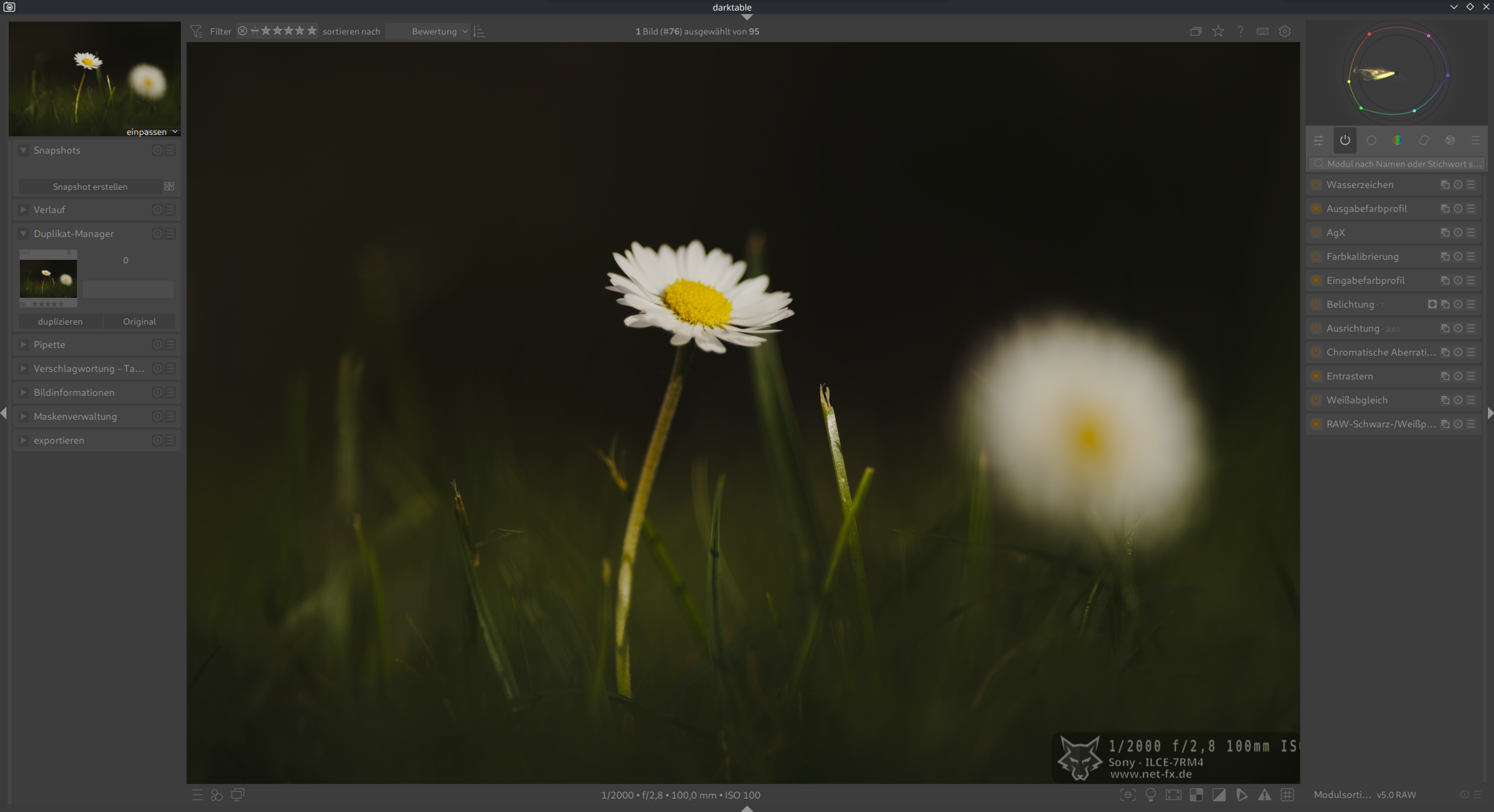
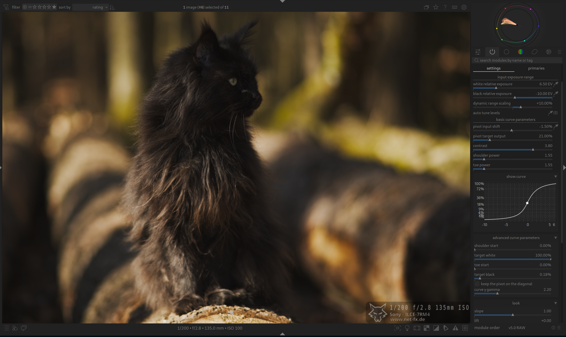
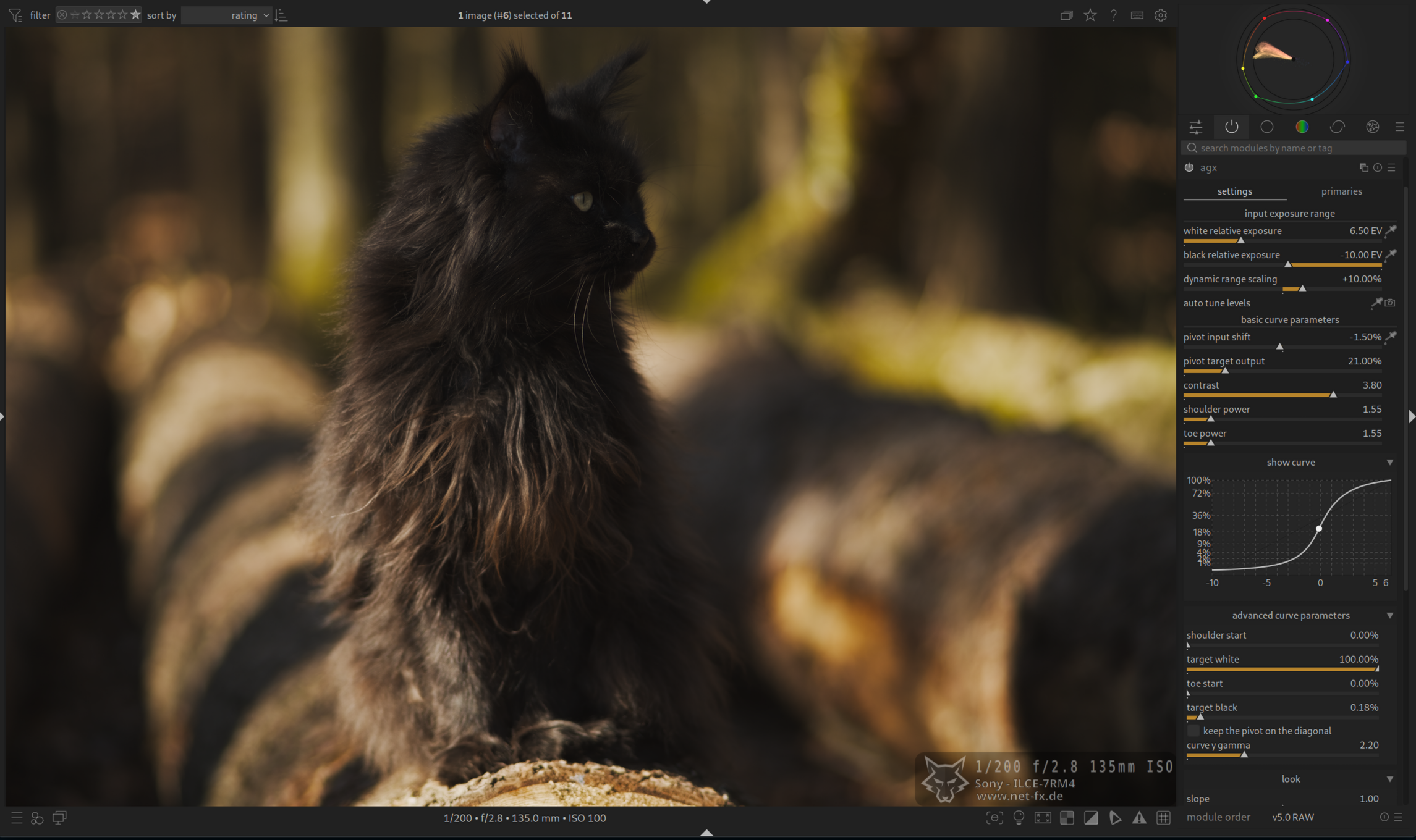
Modernes und minimalistisches Dark-Theme mit minimalen blauen Farbakzenten.
CSS
/* Darktable Theme */
@define-color theme_color @selected_bg_color;
@define-color button_bg #2a3441;
@define-color button_hover_bg #1c4987;
@define-color field_active_bg #212121;
@define-color field_bg #262626;
@define-color field_selected_bg #303030;
@define-color border_color #212121;
@define-color lighttable_bg_color #212121;
@define-color plugin_bg_color #292929;
@define-color fg_color #a3a3a3;
@define-color darkroom_bg_color #212121;
@define-color filmstrip_bg_color #141414;
@define-color bg_color #292929;
@define-color collapsible_bg_color #262626;
@define-color plugin_label_color #808080;
@define-color bauhaus_bg #2b2b2b;
@define-color bauhaus_fill #002347;
@define-color scroll_bar_bg #1a1a1a;
@define-color scroll_bar_inactive #303030;
@define-color scroll_bar_active #00395c;
@define-color thumbnail_hover_bg_color #212121;
@define-color thumbnail_star_bg_color #1c1c1c;
@define-color thumbnail_selected_bg_color #242424;
@define-color thumbnail_bg_color #1f1f1f;
@define-color thumbnail_star_hover_color #002f61;


/* Manually override the thumbnail overlay background */
.dt_overlays_hover_extended #thumb-main:hover #thumb-bottom,
.dt_overlays_mixed #thumb-main:hover #thumb-bottom,
.dt_overlays_hover #thumb-main:hover #thumb-bottom {
    background-image: none;
    background-color: #1c1c1c;
}

#left {
padding: 0 4px 0 0;
}

#left > :not(scrolledwindow) {
padding-left: 4px;
}

#right {
padding: 0 0 0 4px;
}

#right > :not(scrolledwindow) {
padding-right: 0px;
}

/* bottom anchored options */


#plugins_vbox_left > box:not(#basics-box-labels) {
background-color: @plugin_bg_color;
border-radius: 4px;
}

#basics-module-hbox,
#plugins_vbox_left > box:not(#basics-box-labels) {
margin-bottom: 4px;
}


#basics-box-labels widget,
#basics-module-hbox {
background-color: @plugin_bg_color;
}

#basics-box-labels widget {
border: none;

}

#basics-module-hbox,
#plugins_vbox_left frame.dt_plugin_ui {
border-radius: 0 0 4px 4px;
background-color: @plugin_bg_color;
}

#basics-module-hbox {
padding: 0px 0 0px;

}

#basics-box-labels #basics-header-box {
padding: 6px 4px 6px 10px;
}

#basics-module-hbox + widget {
border-radius: 4px 4px 0 0;
}


#plugins_vbox_left #module-header,
#left > box:nth-child(3) #module-header,
#right > box:nth-child(3) #module-header {
border: none;
}


.dt_plugin_ui #blending-tabs .dt_module_btn,
#modules-tabs .dt_module_btn
{
    padding: 0.5em;
    margin: 0.2em;
    border-radius: 4px;
}

.dt_plugin_ui #blending-tabs
{
    border-radius: 0 0 4px 4px;
}

#left > box:first-child,
#modules-tabs {
margin-bottom: 4px
}


.font {
    margin: 8px 0;
}

.dt_plugin_ui #blending-tabs
{
    background-color: shade (@plugin_bg_color, 1.3)
}

.dt_section_label {
    border: none;
    background-color: shade (@plugin_bg_color, 1);
    border-radius: 4px;
}


/* Increase min-height to account for auto-hideable buttons */
#module-header {
min-height: 6px;
}


#module-header .dt_module_btn {
color: shade(@plugin_label_color, 0.6);
background-color: shade(@plugin_bg_color, 0.8);
}


#module-header .dt_module_btn:checked {
color: shade(@button_hover_bg, 0.9);
background-color: shade(@plugin_bg_color, 1.2);
}

#module-header .dt_module_btn:checked ~ .dt_module_btn{
color: shade(@plugin_label_color, 0.85);
background-color: shade(@plugin_bg_color, 0.9);

}
Modernes und minimalistisches Dark-Theme ohne Ablenkung mit minimalen blauen Farbakzenten.
CSS
/* Darktable Theme */
@define-color theme_color @selected_bg_color;
@define-color button_bg #2b2b2b;
@define-color button_hover_bg #002f61;
@define-color field_bg #212121;
@define-color field_active_bg #212121;
@define-color field_selected_bg #2b2b2b;
@define-color border_color #212121;
@define-color lighttable_bg_color #212121;
@define-color bg_color #212121;
@define-color fg_color #808080;
@define-color darkroom_bg_color #1c1c1c;
@define-color filmstrip_bg_color #141414;
@define-color plugin_bg_color #1e1e1e;
@define-color collapsible_bg_color #212121;
@define-color plugin_label_color #808080;
@define-color bauhaus_bg #2b2b2b;
@define-color bauhaus_fill #002347;
@define-color scroll_bar_bg #1a1a1a;
@define-color scroll_bar_inactive #303030;
@define-color scroll_bar_active #00395c;
@define-color text_color #1e1e1e;
@define-color thumbnail_hover_bg_color #212121;
@define-color thumbnail_star_bg_color #1f1f1f;
@define-color thumbnail_selected_bg_color #242424;
@define-color thumbnail_bg_color #1f1f1f;
@define-color thumbnail_star_hover_color #002f61;

/* Manually override the thumbnail overlay background */
.dt_overlays_hover_extended #thumb-main:hover #thumb-bottom,
.dt_overlays_mixed #thumb-main:hover #thumb-bottom,
.dt_overlays_hover #thumb-main:hover #thumb-bottom {
    background-image: none;
    background-color: #1f1f1f;
}Modernes und minimalistisches Dark-Theme mit orangen Akzenten
CSS
/* Darktable Theme */
@define-color theme_color @selected_bg_color;
@define-color button_bg #2b2b2b;
@define-color button_hover_bg #a86b00;
@define-color field_bg #212121;
@define-color field_active_bg #212121;
@define-color field_selected_bg #2b2b2b;
@define-color border_color #212121;
@define-color lighttable_bg_color #212121;
@define-color bg_color #212121;
@define-color fg_color #bababa;
@define-color darkroom_bg_color #1c1c1c;
@define-color filmstrip_bg_color #141414;
@define-color plugin_bg_color #1e1e1e;
@define-color collapsible_bg_color #212121;
@define-color plugin_label_color #808080;
@define-color bauhaus_bg #2b2b2b;
@define-color bauhaus_fill #a86b00;
@define-color scroll_bar_bg #1a1a1a;
@define-color scroll_bar_inactive #303030;
@define-color scroll_bar_active #a86b00;
@define-color thumbnail_hover_bg_color #212121;
@define-color thumbnail_star_bg_color #1c1c1c;
@define-color thumbnail_selected_bg_color #242424;
@define-color thumbnail_bg_color #1f1f1f;
@define-color thumbnail_star_hover_color #a86b00;

/* Manually override the thumbnail overlay background */
.dt_overlays_hover_extended #thumb-main:hover #thumb-bottom,
.dt_overlays_mixed #thumb-main:hover #thumb-bottom,
.dt_overlays_hover #thumb-main:hover #thumb-bottom {
    background-image: none;
    background-color: #1c1c1c;
}Echtes Dark-Theme für Darktable
CSS
/* Darktable Theme */
@define-color theme_color @selected_bg_color;
@define-color border_color #1e1e1e;
@define-color lighttable_bg_color #292929;
@define-color thumbnail_hover_bg_color #212121;
@define-color thumbnail_selected_bg_color #292929;
@define-color thumbnail_bg_color #1c1c1c;
@define-color button_bg #2b2b2b;
@define-color button_hover_bg #00395c;
@define-color field_bg #1c1c1c;
@define-color field_selected_bg #2b2b2b;
@define-color field_hover_bg #00395c;
@define-color fg_color #828282;
@define-color bg_color #212121;
@define-color collapsible_bg_color #1e1e1e;
@define-color field_active_bg #141414;
@define-color darkroom_bg_color #1c1c1c;
@define-color filmstrip_bg_color #141414;
@define-color plugin_bg_color #1e1e1e;
@define-color plugin_label_color #7d7d7d;
@define-color section_label #3c5772;
@define-color scroll_bar_bg #1a1a1a;
@define-color scroll_bar_inactive #303030;
@define-color scroll_bar_active #00395c;
@define-color bauhaus_bg #2e2e2e;
@define-color bauhaus_fill #00395c;
@define-color bauhaus_indicator_border #213b59;
@define-color thumbnail_star_hover_color #787878;
@define-color text_color #1a1a1a;
@define-color field_fg #173064;
@define-color thumbnail_star_bg_color #1c1c1c;

/* Manually override the thumbnail overlay background */
.dt_overlays_hover_extended #thumb-main:hover #thumb-bottom,
.dt_overlays_mixed #thumb-main:hover #thumb-bottom,
.dt_overlays_hover #thumb-main:hover #thumb-bottom {
    background-image: none;
    background-color: #1c1c1c;
}Modernes graues Darktable-Theme
CSS
/* Darktable Theme */
@define-color theme_color @selected_bg_color;
@define-color border_color #4f4f4f;
@define-color lighttable_bg_color #3b3b3b;
@define-color thumbnail_hover_bg_color #404040;
@define-color thumbnail_selected_bg_color #383838;
@define-color thumbnail_bg_color #4a4a4a;
@define-color button_bg #4a4a4a;
@define-color button_hover_bg #00395c;
@define-color field_bg #474747;
@define-color field_selected_bg #3d3d3d;
@define-color field_hover_bg #00395c;
@define-color fg_color #c2c2c2;
@define-color bg_color #4f4f4f;
@define-color collapsible_bg_color #424242;
@define-color field_active_bg #454545;
@define-color darkroom_bg_color #4a4a4a;
@define-color filmstrip_bg_color #454545;
@define-color plugin_bg_color #474747;
@define-color plugin_label_color #b0b0b0;
@define-color section_label #454545;
@define-color scroll_bar_bg #4a4a4a;
@define-color scroll_bar_inactive #424242;
@define-color scroll_bar_active #003f66;
@define-color bauhaus_bg #4a4a4a;
@define-color bauhaus_fill #00395c;
@define-color bauhaus_indicator_border #213b59;
@define-color thumbnail_star_hover_color #787878;
@define-color text_color #1a1a1a;
@define-color field_fg #404040;
@define-color thumbnail_star_bg_color #4d4d4d;

/* Manually override the thumbnail overlay background */
.dt_overlays_hover_extended #thumb-main:hover #thumb-bottom,
.dt_overlays_mixed #thumb-main:hover #thumb-bottom,
.dt_overlays_hover #thumb-main:hover #thumb-bottom {
    background-image: none;
    background-color: #4d4d4d;
}